When it comes to explainer videos, context is everything. After investing thousands (sometimes tens of thousands) of dollars in creating a video, you need to make sure that your investment pays off in the form of increased conversions.
That’s where a call-to-action (CTA) comes in. Often, brands will produce extremely entertaining content, leaving audiences hungry but confused about what to do next. That’s why we put together this guide — to walk you through the basics of context, conversions, and CTAs. Let’s get started.
What Exactly Is a CTA, and Why Are They Important?
CTAs are almost second-nature to consumers online. If you’ve browsed the Internet, you’ve seen them in the form of ‘click here,’ ‘buy now,’ and ‘submit’ buttons. In the last few years, the marketing and conversion optimization communities have really made an art out of them, experimenting with creative and compelling offers that help users visualize what happens after ‘the click.’
That’s why you see CTAs that say ‘learn more,’ ‘try now,’ or ‘get it free’ — because companies want to convince users to take action and ultimately make money.
Tip #1: Tie Your Video Back to Your Conversion Funnel
What do you want your audiences to do after watching your video? Are you hoping that they will sign up for a free trial or maybe dig deeper to learn more?
No matter the ‘next steps’ in your company’s conversion funnel, it’s important to be very clear about what you want your audiences to do.

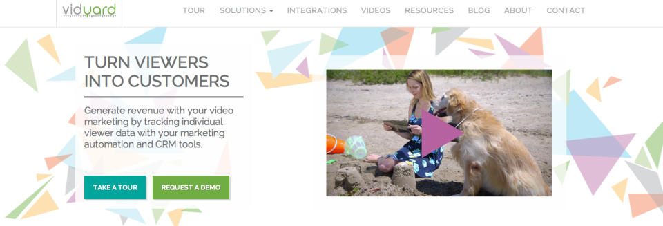
There is absolutely no way that audiences can feel confused on what to do next after watching the video. VidYard gives its viewers a clear framework for next steps, enhancing the sales experience of a standalone piece of content.
Tip #2: Make Your Video Worth Your Audience’s Time
Online audiences have limited attention spans, and they’re constantly bombarded with more content than they can handle. When they see the ‘click to play’ button, they’re probably wondering whether it’s worth their time to learn. They’re looking to quickly absorb as much information as they can, but they’re reluctant to watch something that is a potential waste of time.
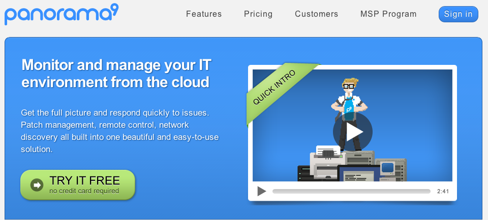
IT monitoring service Panorama9 addresses this problem with a “quick intro” banner that’s superimposed on the video itself — making the value proposition enticing.

In this particular context, the CTA is the ‘play’ button, which may at first glance seem unrelated to the conversion process. Keep in mind, however, that learning is very much a part of the conversion funnel, and the process of watching an explainer video is crucial for quickly and effectively educating your audience.
Make it clear that your video provides the quickest path for your audience to learn — and that it’s worthwhile to watch.
‘Try It Free’ is the ultimate goal of Panorama9’s homepage — the company wants to drive free trial sign-ups in hopes that audiences will ultimately become paying customers. Watching the (hilarious) video is a key first step.
Tip #3: Let People Pick and Choose What and How They Want to Learn
As you explore the world of conversion optimization, you’ll learn that there are a lot of best practices. The thing about these learnings, however, is that they’re far from universal. Every audience is different, and every business will need to test what works for them.
One running concept in online marketing is to keep things simple — to give people only one CTA and make the conversion path extremely clear.
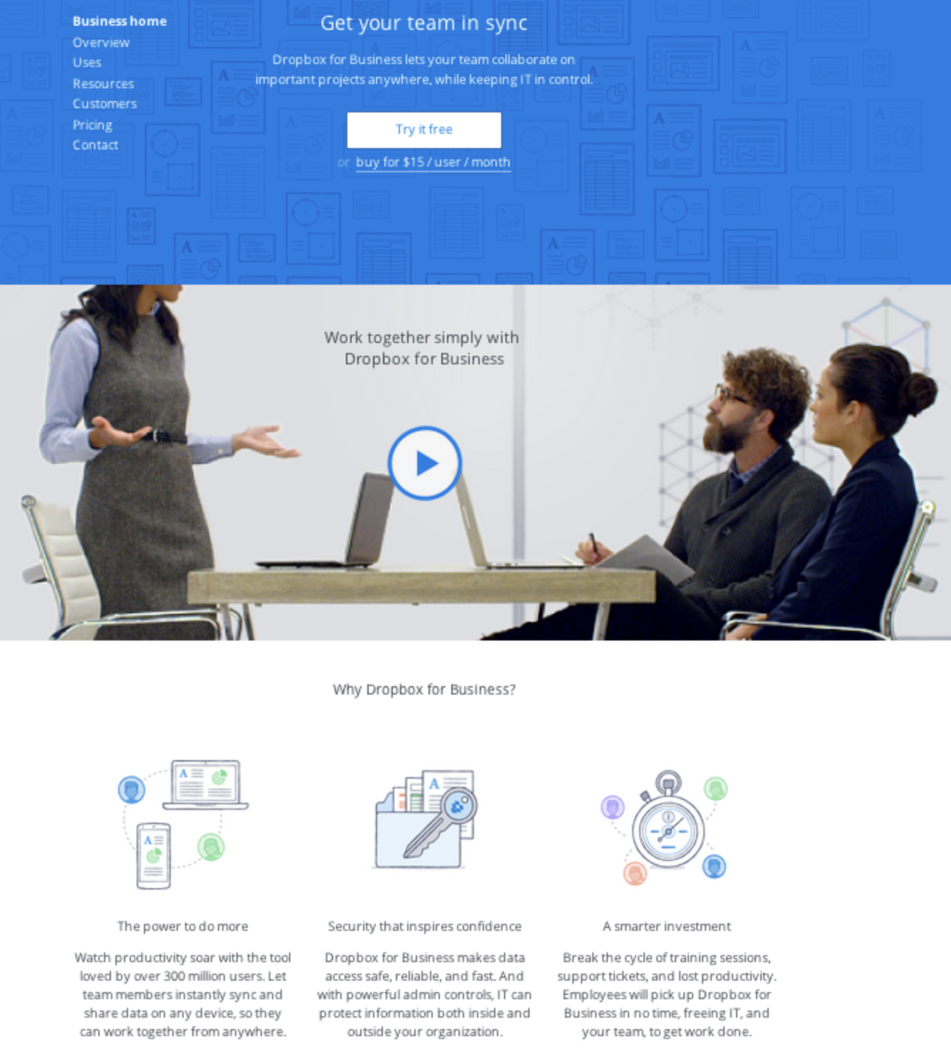
But on this webpage, Dropbox has taken a seemingly opposite page to give audiences lots of resources — it’s up to the viewers to choose whether they want to watch a video or read.

The fact is that people learn in different ways. Video will resonate with some but not with others, who may prefer to read. Consumers are smart and will self-direct their own research. Dropbox’s customers, especially, tend to be tech-savvy and information driven.
In addition to placing your videos in context, it’s important to know your users in context too.
Final Thoughts
When in doubt, test relentlessly and talk to your audience. Learn how they’re using your video — and what stage of the conversion funnel they’re likely to be in when they watch what you’ve put together. This information will help you craft compelling, high-impact CTAs.
What do you think? What have you learned from the tests you’ve run? Share your thoughts in the comments section below.
More Resources
If you’re looking for more of an overview of the topic or are looking to dive deeper, check out this blog post from Michael Aagaard of ContentVerve, which explains how to design website CTAs that convert.