Views. Shares. Click-Throughs.
A lot of people look at those three metrics and feel like only the first two actually relate to video marketing. Click-throughs would be great but that most likely won’t come from web videos for your business.
For click-throughs, you need banner ads, paid keywords, or social media posts. After all, the reason that you mention your URL at the end of the video is so people will type that address into their browser and find you that way, right?
Maybe in the past but times, they are a-changin’! Nearly every video host out there (Wistia, YouTube, Vimeo, etc.) gives you multiple options to consider in order to get more people clicking directly from your video to a location of your choosing. Although all video hosting services don’t have the ability to add links overtop of your video (aka annotations) there are still ways to try and leverage clicks with pretty much all of them.
Because even if viewers are on your homepage, guess where they aren’t yet? The “Thanks for contacting us!” (or your version of it) page that comes after submitting a quote or requesting a demo. It’s beneficial to stack the odds in your favor for viewers getting one click closer to where you want them.
At the end of the day, these clicks are all centered around website engagement which has become more important than ever. So let’s explore the best ways to get a lot of action, traction, and positive reactions from your video clicks.
Add Annotations
A few video hosts (namely Wistia and YouTube) allow you to add these clickable text boxes, images, or icons to your video. These can slide over, fade into, or just pop up in different areas of your video, and are a great way to catch the viewer’s attention. A screenshot of Feedvisor’s YouTube video shows a non-intrusive annotation in the bottom left that slides out when the cursor hovers over the video.

It can be easy to get carried away with adding annotations to every section of your video and trying to double down on efforts to get people to click. However, we recommend using no more than 3 annotations in a 60-second video. Also for the annotations you do add, it’s best to keep them on screen for only 3 – 5 seconds each.
Bonus Tip – If you’re hosting your video on YouTube, avoid putting annotations in the middle of the bottom third of your screen because ads can end up blocking them.
Entice With Your Text
Just like a call-to-action you want to make sure you engage the viewer but don’t come across too “sales-y” with your annotation text. You also have far fewer characters to work here than you have in your script because you want to avoid annotations from taking up too much real estate on the screen.
Usually, it’s best to tie the copy of the annotation in with the script of the video. That way it doesn’t seem like you’re just slapping any old group of letters on there in order to get a click – making it more thoughtful for those watching.
For example, if at one point your video asks a light-hearted question about website performance, it can be a good idea to reference (or tease the answer to) that question in the annotation copy. So, while you’re writing your script think about how and where annotations could be used.
Channel Viewers Appropriately
It can be tough but resist the temptation of making every annotation or link send viewers to your quote page when clicked. That may move them down the sales funnel, but they may have additional questions about your product or want to find out more about who you are as a company first.

Try to add links to pages that are relating to the particular subject matter in certain sections of your video. If the video starts discussing how your solution works that’s the best time to link to the ‘How It Works’ section of your site in case people want to hear more than you can include in the video.
You can also cross-pollinate across a few of your blog pages in order to up your website engagement (there it is again) too. We recommend seeing which posts are most successful at generating leads and linking to those more often than others.
Don’t Forget Description Links
Not all video hosts have this capability but if people come across your video on Vimeo or YouTube, you can add some text links in the description of your video. Some people prefer this method because they feel like it’s less obtrusive and avoids disrupting the integrity of the video they’ve worked so hard to produce.
However, we often come across videos where the description is too wordy and the link is buried at the end of the description which ends up pushing it below the dreaded fold.

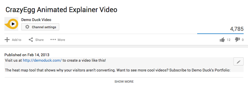
Trying keeping the description to 2 sentences or less and adding in your link in the first sentence to ensure it’s visible without people having to click on “Show More.” As you can see in the above description for one of our YouTube videos, we put the website link first and then gave a brief description of the CrazyEgg platform.
Summary
Although they were the main focus of this post, it’s not just sales or marketing videos that can leverage clicks. Effective link usage can help customers can find your support page easier, employees quickly get to the next video tutorial, and a whole lot more.
No matter how you do it, just keep in mind that it’s important to remember that your online video isn’t being broadcast on television, it’s part of a more interactive experience. So whether it’s annotations, description links, or adding other clickable areas around your video – start moving viewers down the right path and encouraging them to dig a deeper with as little effort as possible.
How can you get more clicks from your video? Here are some suggestions from the team at Demo Duck, a video production company in Chicago, IL.
- Demo Duck is known for producing videos, but also has expertise in driving video engagement as well.
- Add Annotations. A few video hosts (namely Wistia and YouTube) allow you to add clickable text boxes, images or icons to your video—which are great ways to capture a viewer's attention. Demo Duck recommends using no more than 3 annotations in a 60-second video, and to keep them on screen for only 3 to 5 seconds each.
- Entice With Your Text. Engage your viewer but don't come across too "sales-y" with the annotation text. One idea is to tie the copy of the annotation in with the script of the video.
- Channel Viewers Appropriately. Whether it's in annotations or copy, add links to pages that relate to the particular subject matter in certain sections of your video. Resist the urge to constantly move viewers down the sales funnel, as they might also have questions about your product or company.
- Don't Forget Description Links. Some video hosts allow you to add text links in the description of your video. If possible, keep the description to two sentences or less. And add your link in the first sentence to ensure it's visible without people having to click on "Show More."