We’re going to talk about the three Cs: Creativity, Complexity, and Cost in animated videos.
Today, I’m mainly going to focus on Complexity in animation. It’s quantitative yet ignored, which makes it interestingly different from Creativity and Cost, but all three are very connected.
What do we mean exactly? Complexity is often seen as something subjective, but in the animation world, it’s pretty easy to measure because it’s more labor intensive — more billable hours for the creative talent. However, because of its subjectivity, it’s easily overlooked.
So, let’s get the important thing out of the way. Creativity is not the same as Complexity. Let me show you want I mean.
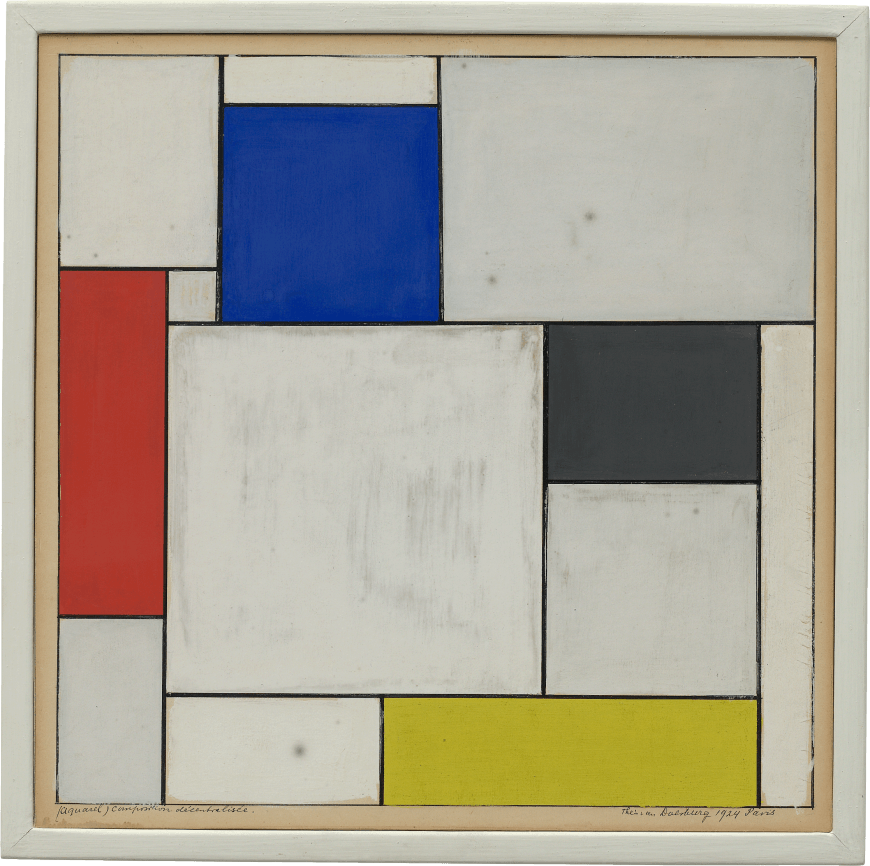
Here’s a popular painting:

This is the “Composition Décentralisée” painted by Theo-van-Doesburg in 1924. I consider this piece to be an example of low complexity. Why exactly? With the use of solid-only colors and stark use of geometrical shapes, it portrays its meaning through
saying very little.
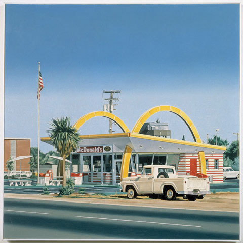
Here’s another popular painting:

This is a piece from the late-60s Photorealism art movement. Now, look at that level of detail! The signature style is the intense attention to detail (source), so you can only imagine how long it takes for an artist to produce a painting — thus it makes it an example of high complexity.
But what about creativity? Is the first creative because it sprung completely from the mind of the artist? Is the second uncreative because he referenced photographs of objects and places?
I can’t answer that, but I can say they’re probably expensive because both are in the Guggenheim.
But back to video and complexity. Four factors determine complexity in animation: Duration, Detail, Characters, and Technique. We’ll go through each in further detail and talk about how you can balance the four to meet both your budget and storytelling goals.
Complexity in Animation: Duration
A longer video takes more time to create. While that’s rather obvious, some efficiency can be found as motions or assets are reused. When we partner with our clients, we want to learn everything about their video strategy. That way we can maximize the budget. If they plan on doing more after an explainer video, such as branded content or commercials, everything looks cohesive.
When thinking about the length of your video, you’ll need to consider what type of content you’ll be covering. Are you doing an educational video or tutorial that covers a topic pretty comprehensively? If so, length and duration are an important factor in determining your budget. If you’re hoping to do a quick ad to spur interest, then detail and technique are where you should invest your money.
Speaking of…
Complexity in Animation: Detail
More moving pieces require more time. If there are things like textures, accents, or pieces that need to be true to life, each second of animation takes longer to animate.
Here’re a couple examples of both high and low complexity in animation:
SkillSurvey here is really clean in its design. Its assets are simple, flat, and there aren’t many things moving on the screen which make it a great example of a project with low complexity, but yet high impact. For SkillSurvey, their storytelling goal was to show how easy and simple it is to use their product — so it makes sense to replicate this concept in their video.
Here is an example of high complexity in animated video:
The Clear Progress Project video has a lot of imagery in each frame, so that’s a lot of moving pieces to animate! For Clear Progress, it was important to be very visually stimulating so their viewers were able to remember their name and what they do. If you’re interested in learning more about this topic, check out our blog post on 6 Scientific Reasons Online Video Connects With Viewers.
When thinking about the level of detail to include in your next video the most important thing to consider is your branding. Are your graphic assets high in detail or tend to be flatter in design? Whatever the case, make sure that the level detail is consistent across all of your marketing materials.
Complexity in Animation: Characters
Characters also have a lot of moving parts but deserve special mention. If we want to move an icon, we slide it from point A to point B. If we need to move a character, they need to walk there, so it requires moving their legs, arms, and torso.
Let’s look at two character-based videos to see how high and low complexity differ with character design.
Cerberus used lots of cute characters. They’re a lot more complex because they need to walk, react, and look alive. For them, it was important to use a character-based story so viewers feel a stronger connection to the problem at hand (file sharing issues) and the solution (their software). Now if only we could find a solution to all those GIF-based chain emails we get from our coworkers…
Anyway, I digress. In this Bionic video (see below), we still use characters, but their motion is a lot simpler because there is less to move across the screen.
As you can see, characters are extremely versatile — they can be designed to fit your needs and your budget. However, we find that if you want to use characters that you should consider a video series. This brings us back to our point of being able to reuse assets. If your customers feel connected to your characters, you should continue to use them in other videos. If you got a good thing going…. Well, we never knew how that phrased ended, so let’s just jump into the next topic.
Complexity in Animation: Technique
Speaking of transitioning, the main two approaches for motion in 2D animation are letting a computer create in-between frames (or in the biz, we refer to as “tweening”), or creating each by hand (think of old school Disney movies). These approaches aren’t exclusive and they can’t always replace each other.
When we let the computer “tween” our frames, we get smooth motion and low complexity. Here is an example from our ReUp video:
When we use traditional, cel animation, we’re able to show things rotating or morphing better. Check out our video for Smart Family Photo Album:
Tweening between frames is a great solution for a project that has a rush timeline, so if you know that your project needs to be done right away, it’s best to go with that option. However, cel animation is preferred when working with characters to make them appear more human.
Wrap-up
When thinking about a budget for an animated video, consider the level of complexity as a major factor. And remember, reduced complexity doesn’t mean you have to sacrifice creativity.
Do you have additional insights on complexity in animation? Add them to the comments below or tweet us.
Itching to learn more about video? Here are other great posts:
How to Take Your Video from Good to Great
